Paotsin Cups Re-design
Paotsin, a brand synonymous with delicious flavors, recognized the need to evolve, not just to keep pace with the times, but to truly lead. They approached us with a clear vision: to create a Paotsin experience as visually exciting as it is delicious, transforming their cups from mere packaging into a powerful touchpoint. Inspired by the elegant simplicity of their iconic logo mark, we crafted a new cup design that echoes its core essence. This design isn't just trendy; it's strategically designed to build a stronger, more recognizable brand, one that resonates with a new generation while honoring their rich heritage. By seamlessly integrating the cup design with the established visual language of the logo—drawing inspiration from its shapes, lines, and overall aesthetic—we've achieved a consistent brand message across every interaction – from the first glance to the last sip. This cohesive visual language strengthens brand recall, ensuring every Paotsin experience is instantly recognizable and uniquely their own. It's a design that speaks volumes, reinforcing their commitment to quality, innovation, and a truly delightful customer journey.
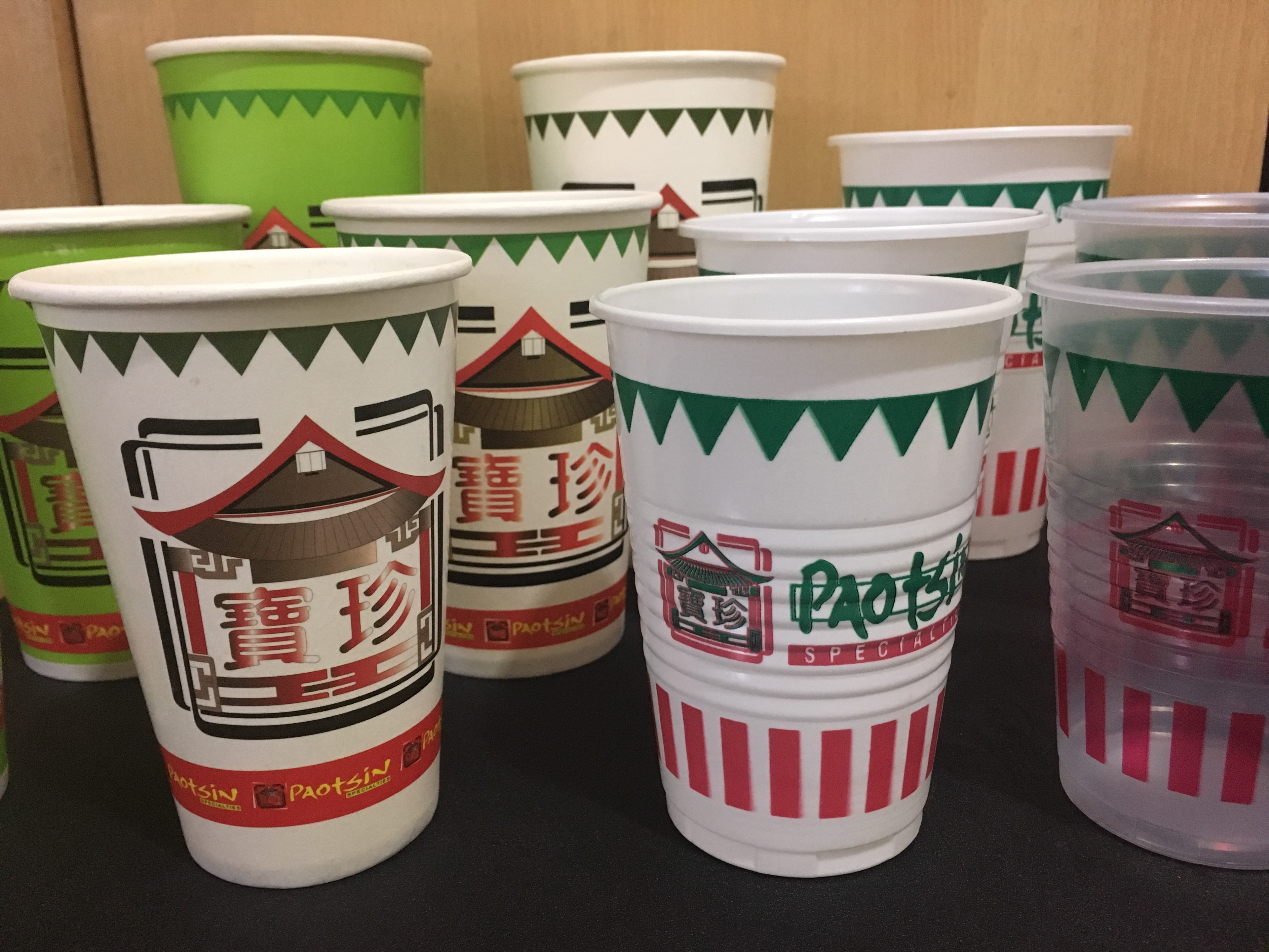
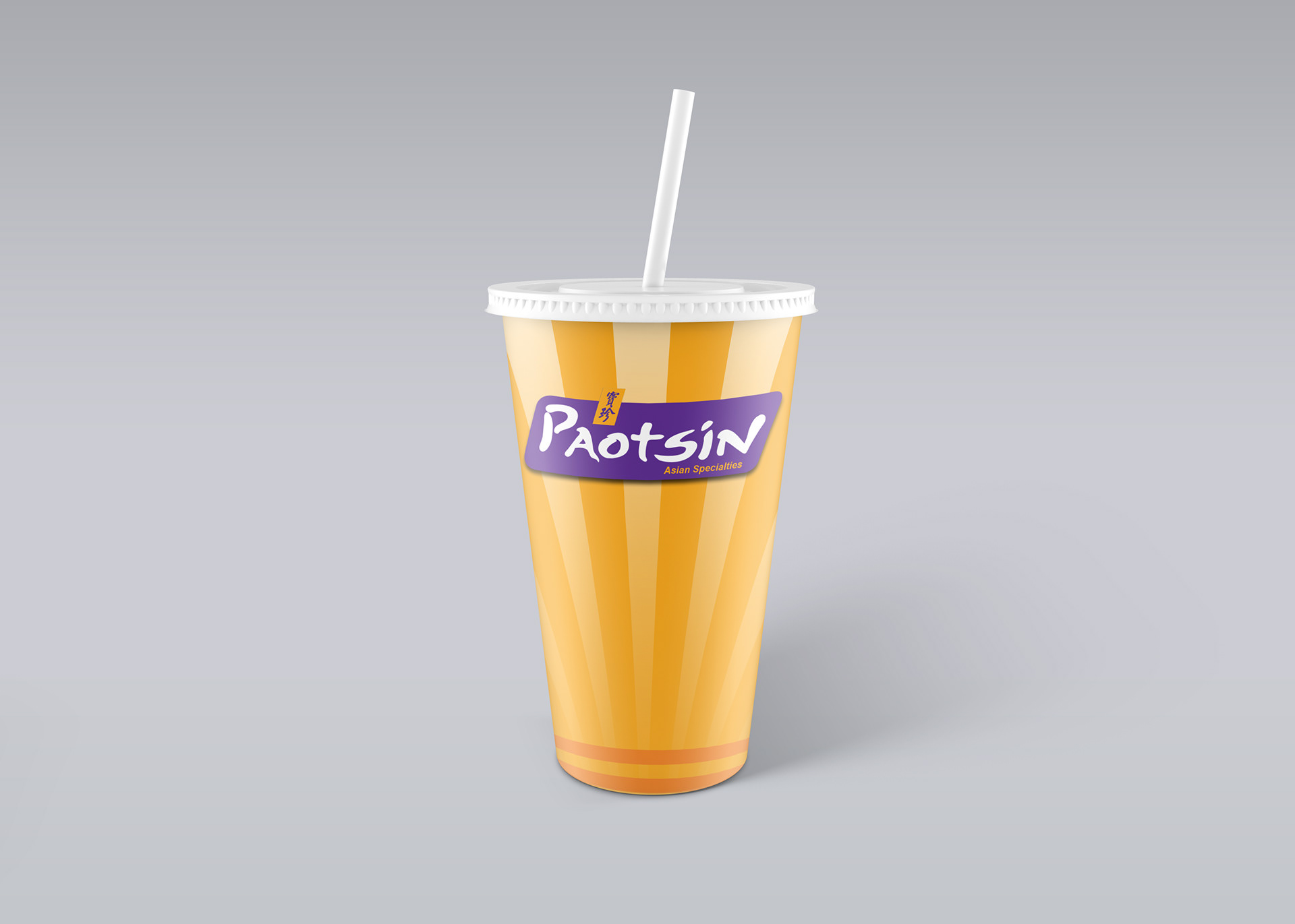
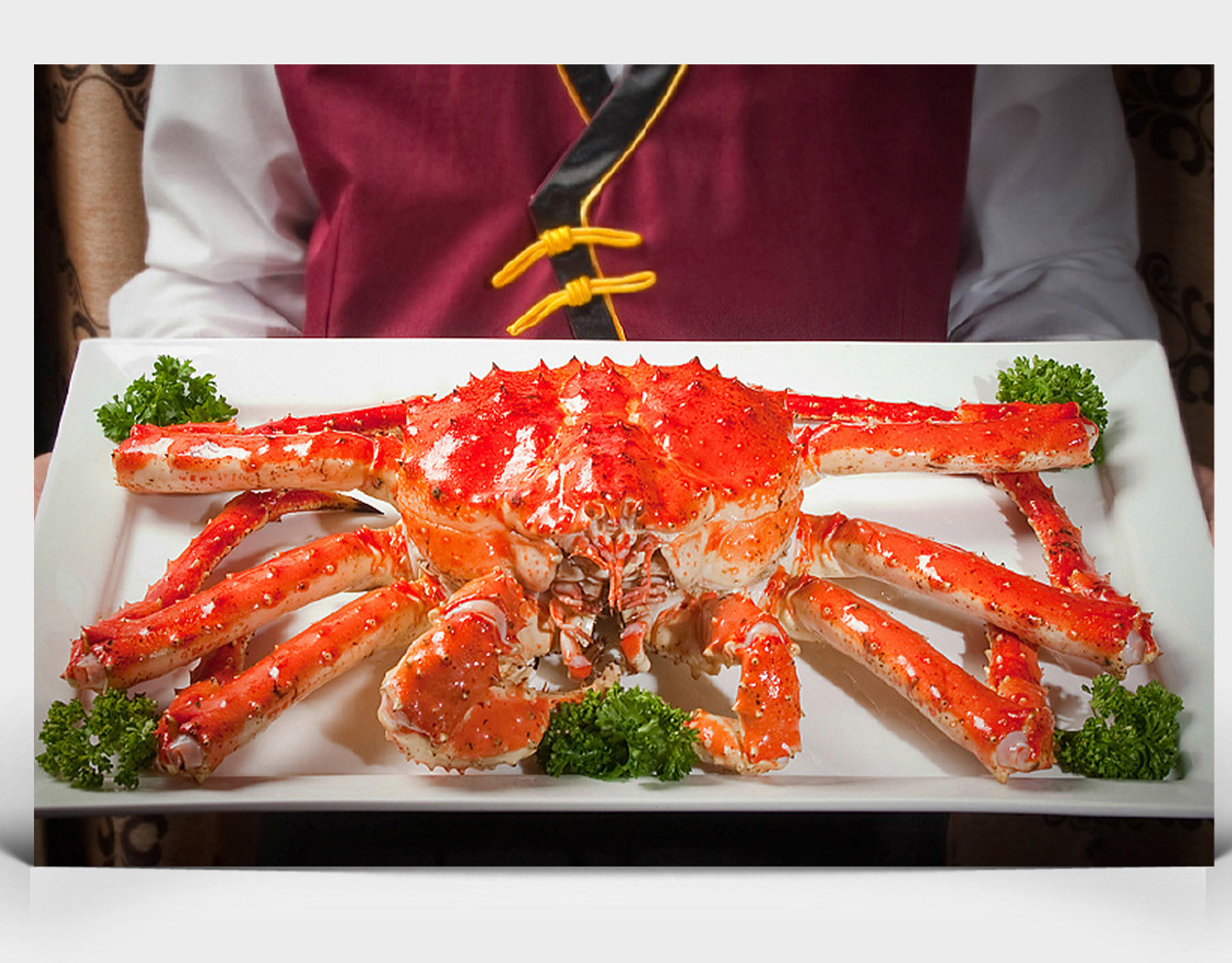
Above: Original Cups for Re-design
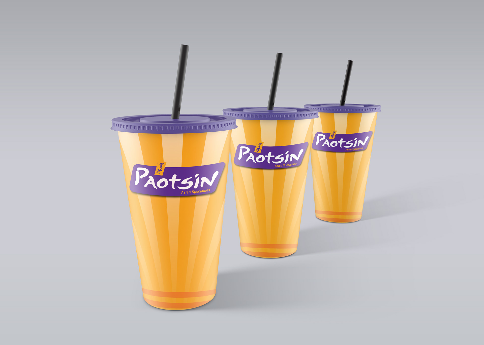
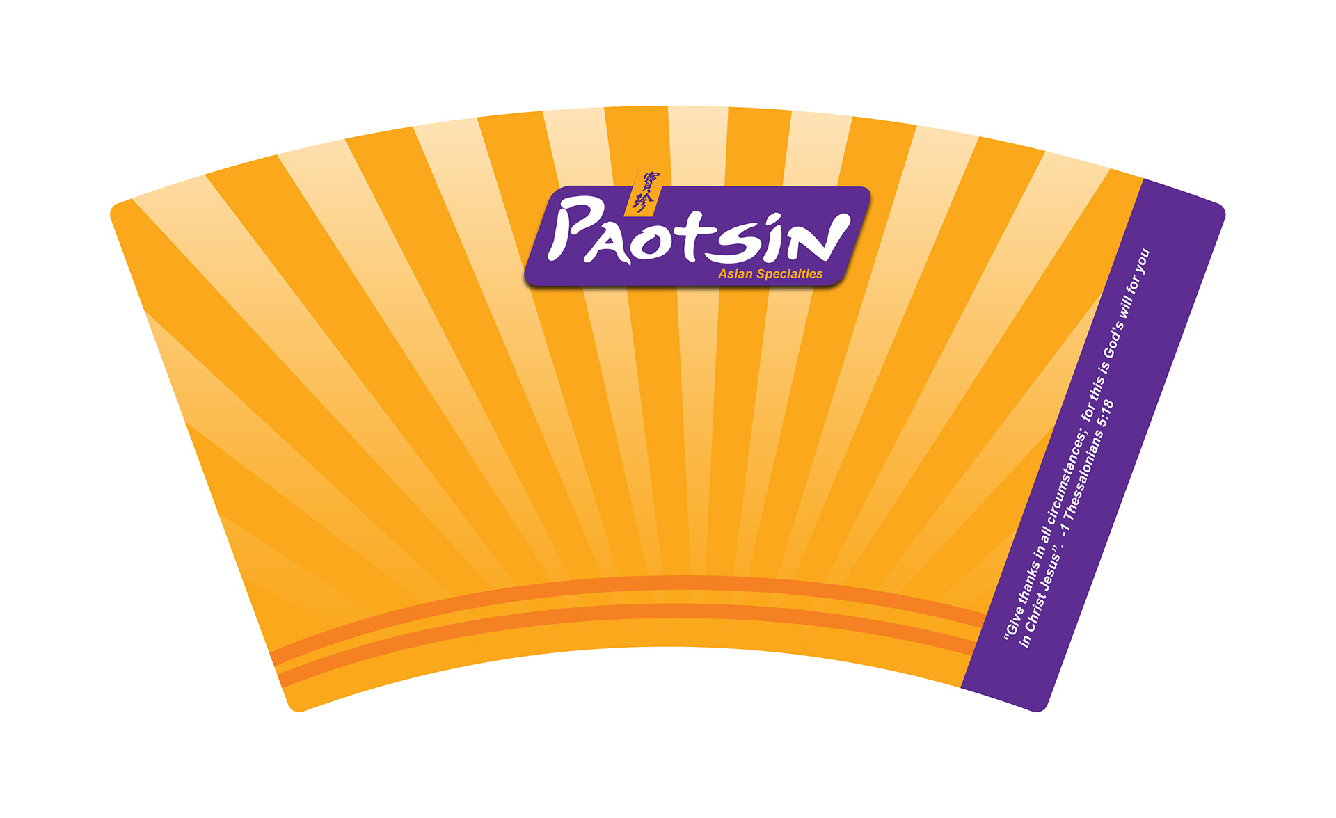
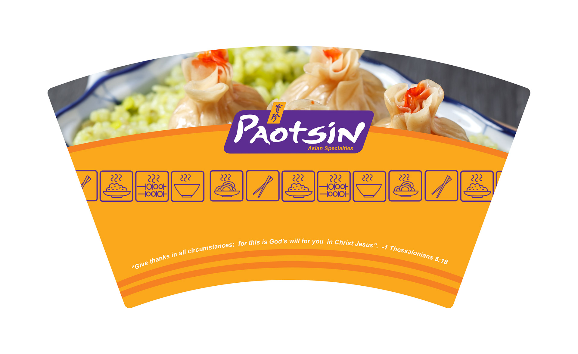
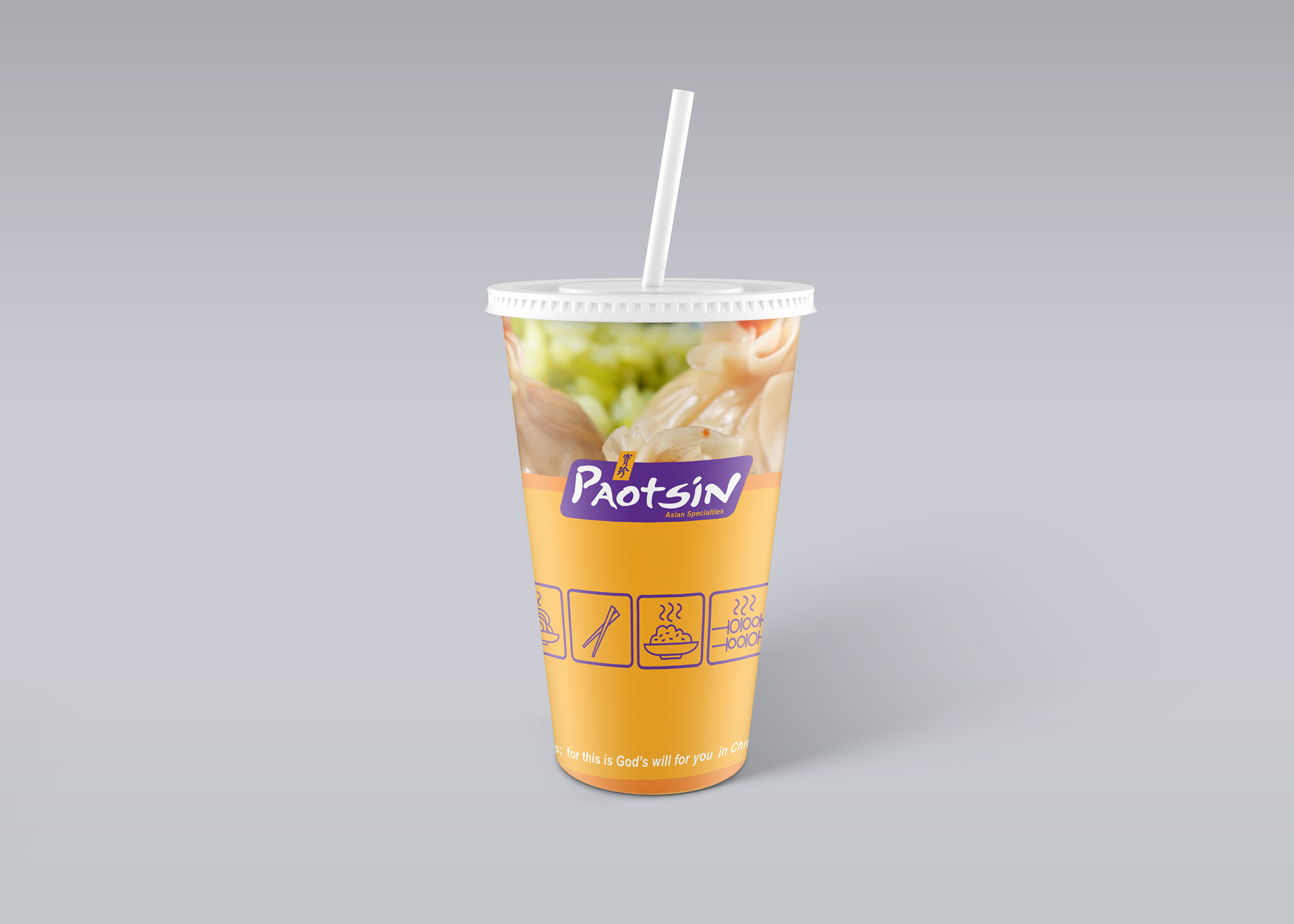
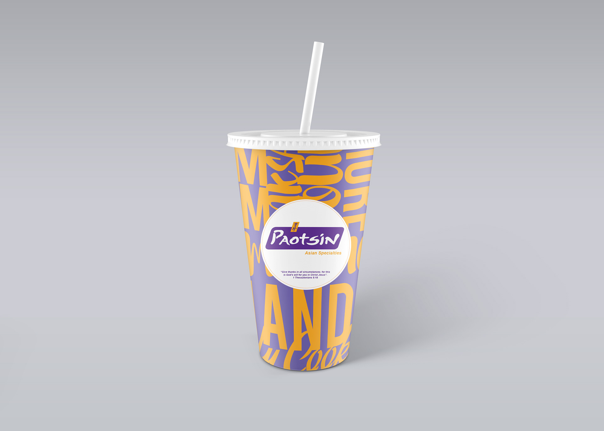
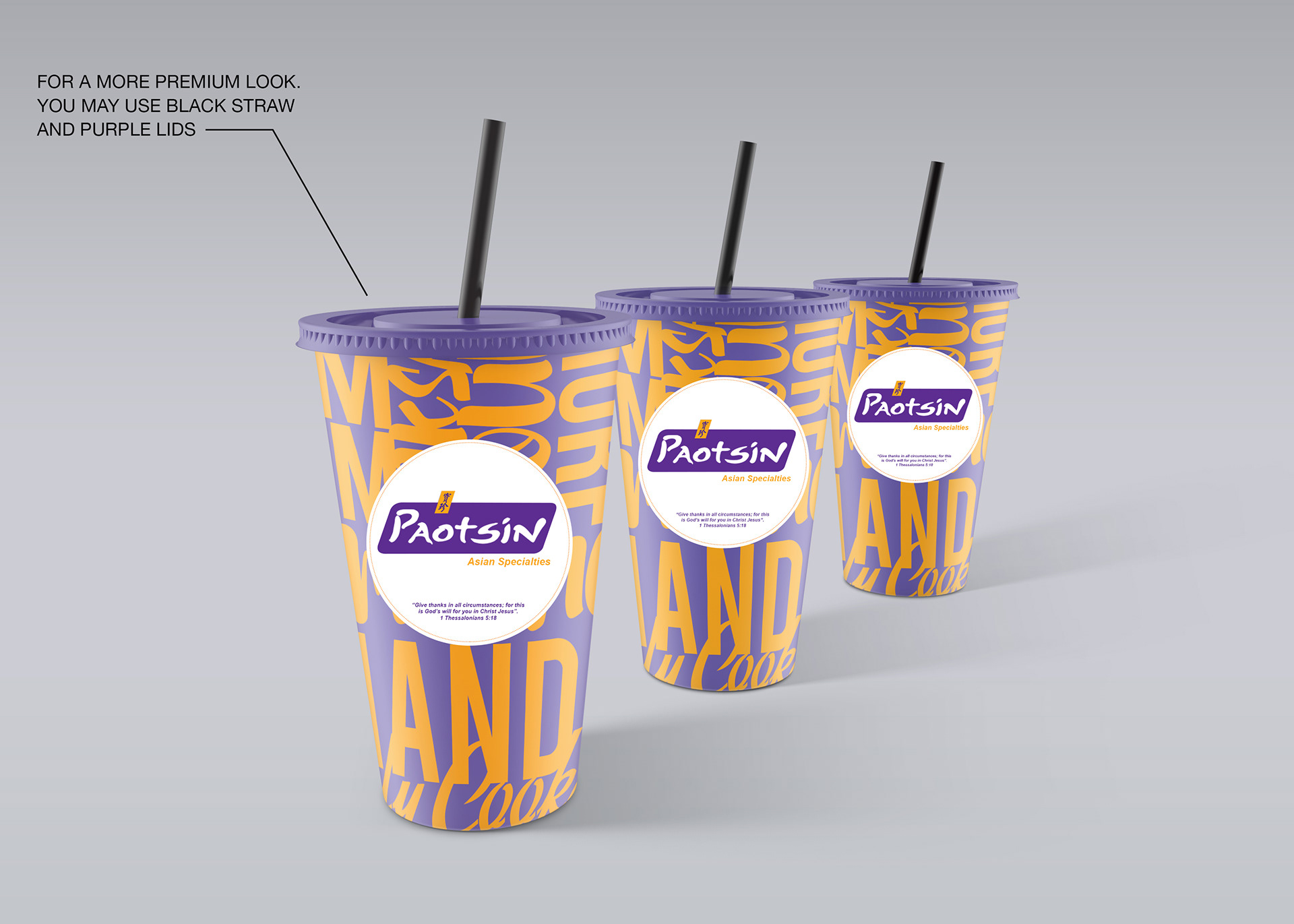
Below: Approved Design
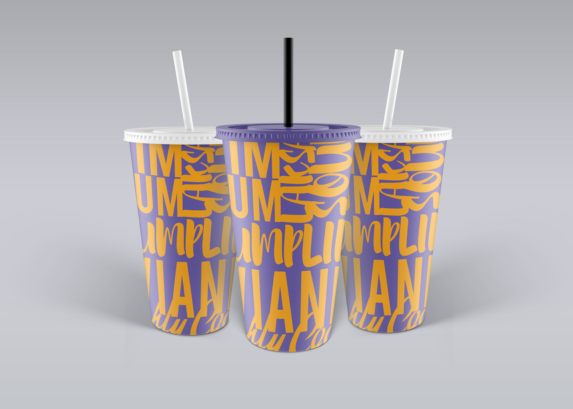
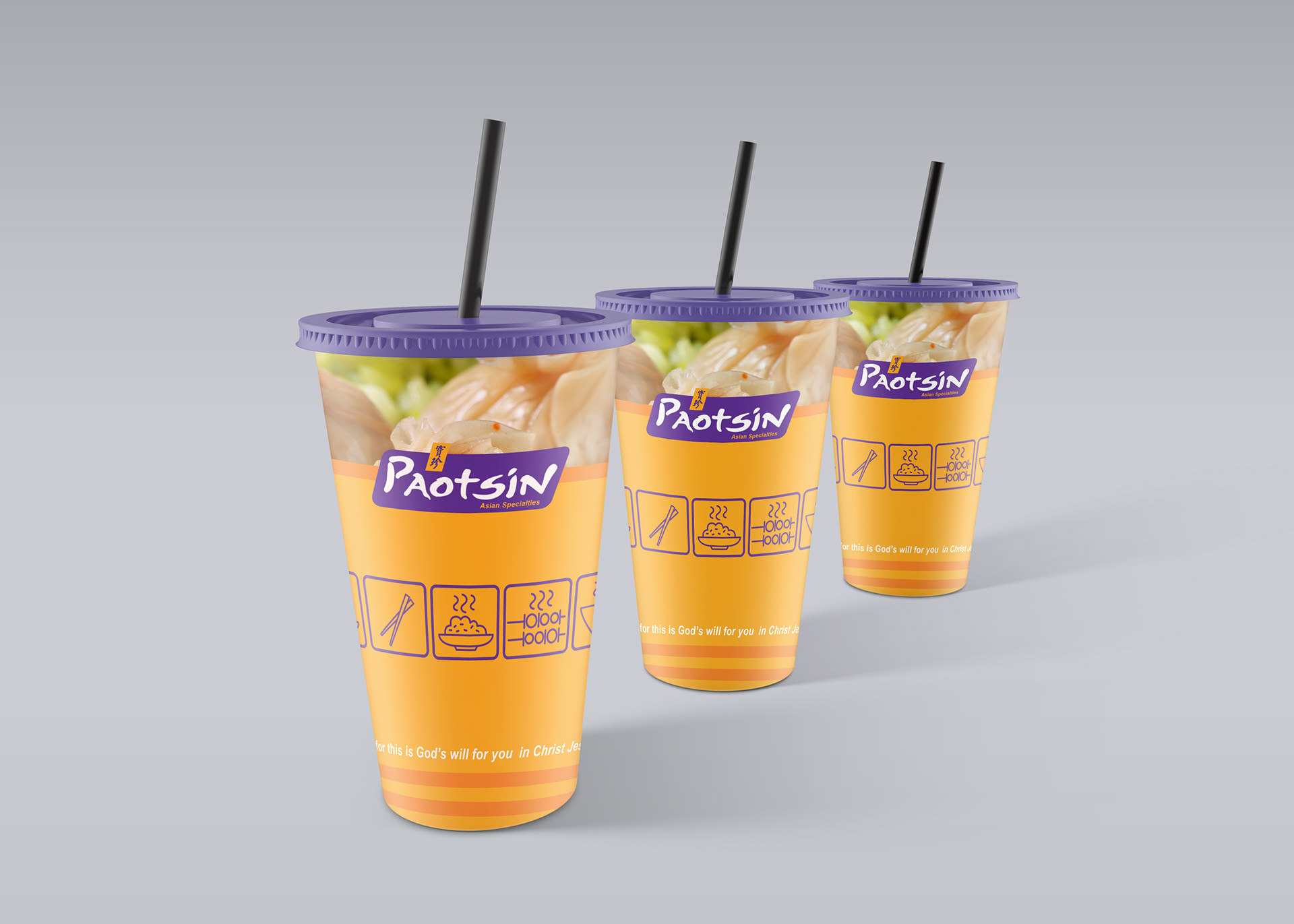
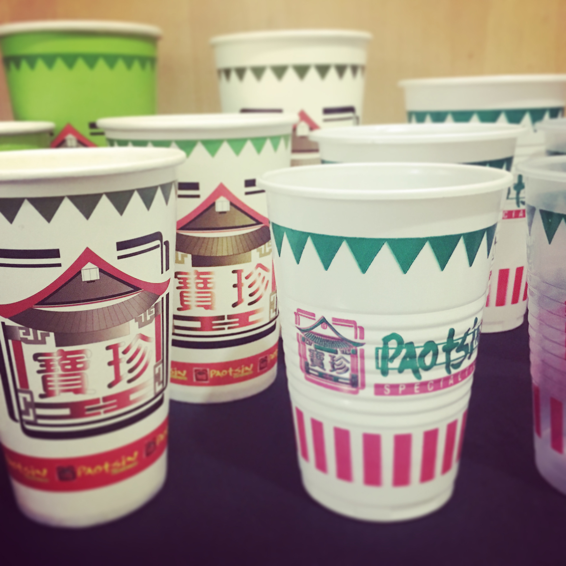
Below: Are some of the Design studies that didn't push get approved